Ultimate Guide to Carousel Alignment and Spacing
Social Media
Mar 9, 2025
Master Instagram carousel design with essential tips on alignment, spacing, and tools to create visually appealing content.
Want your Instagram carousels to look polished and professional? Proper alignment and spacing are the keys to creating visually appealing, easy-to-read designs. Here's what you'll learn in this guide:
Alignment Basics: Use grids, consistent margins, and proper text/image placement for clean layouts.
Spacing Tips: Maintain balanced spacing between elements and use white space effectively to reduce clutter.
Advanced Techniques: Create seamless multi-slide flows and experiment with breaking the grid for dynamic designs.
Tools to Use: Apps like Pano and software like Canva, Photoshop, and Figma help streamline your design process.
Quick Tip: Always preview your carousel on mobile devices to ensure everything looks great across screen sizes. Ready to elevate your carousel game? Let’s dive in!
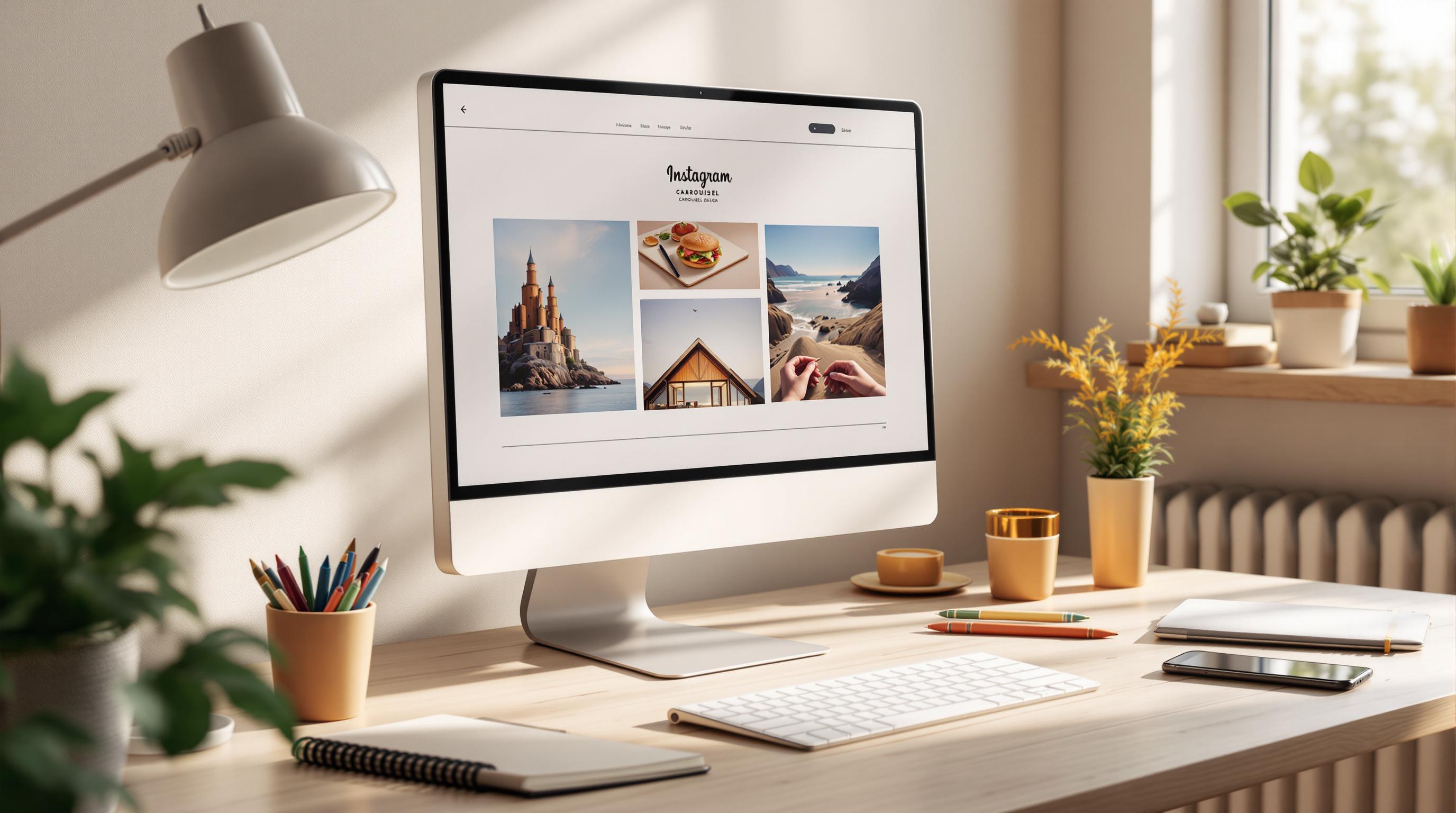
Instagram Carousel - Step by Step Photoshop Tutorial
Basics of Carousel Alignment
Creating visually appealing Instagram carousels starts with understanding alignment. These principles help you design polished, attention-grabbing content.
Working with Grids
Grids provide a structured layout, ensuring every element is positioned neatly.
Here’s how to use grids effectively:
Keep slide-edge margins consistent.
Divide slides into clear columns for organized content placement.
Align text to a baseline for uniformity.
Space elements evenly for balance.
Tip: Many design tools include grid features that snap elements into place automatically. For example, Pano offers a smart alignment system, making it easy to position elements perfectly within your carousel slides.
Aligning Text and Images
Proper alignment of text and images ensures a smooth visual flow.
Text Alignment
Align headings consistently across all slides.
Use uniform spacing between paragraphs.
Maintain consistent text margins.
Ensure text blocks follow the grid structure.
Image Alignment
Center key elements within their spaces.
Align multiple images along shared edges or centers.
Keep padding consistent.
Use similar image dimensions for related slides.
Establish a clear hierarchy between main and secondary elements to create a well-organized layout.
Since most users view Instagram carousels on mobile devices, always preview your design on different screen sizes to ensure it looks great everywhere. Once alignment is set, refine spacing to improve the overall flow of your carousel.
Spacing in Carousel Design
Once your alignment is spot-on, focusing on spacing can take your carousel design to the next level. Proper spacing helps make Instagram carousels visually appealing and easy to follow. It naturally guides the viewer's eye and improves readability.
Tips for Spacing Between Elements
Getting the spacing right means organizing items in a way that feels natural. Here are a few tips:
Leave enough space between text blocks, images, and other elements to establish a clear visual hierarchy.
Group related elements together and separate unrelated ones to improve the flow of your design.
Now, let’s look at how empty space can make your design even better.
The Power of Empty Space
Empty space, or "white space", plays a big role in design. It reduces clutter, draws attention to key elements, and gives your carousel a polished, professional feel.
Design tools can help you maintain consistent spacing. For instance, Pano includes a feature that lets you "Snap elements into place perfectly".
Pro Tip: When unsure, go for a layout with more space. A roomier design often looks cleaner and more professional.
Pro Tips for Alignment and Spacing
Take your carousel design to the next level with smarter alignment and spacing techniques. These tips will help you keep your design polished and visually appealing, even when trying out new ideas.
Connecting Multiple Slides
Once you've nailed the design of individual slides, it's time to focus on creating a smooth visual flow across your entire carousel. Think of multi-slide carousels as a single, connected canvas.
Consistent Alignment Across Slides
Pano’s snap-to-grid feature ensures that spacing and alignment stay consistent from one slide to the next.
Creating a Seamless Flow
To visually connect slides, try these techniques:
Extend margins across all slides for a unified look.
Keep text elements aligned to the same baseline.
Use identical header positions on every slide.
Apply equal spacing between elements throughout.
Breaking the Grid
After mastering standard alignment, breaking the grid strategically can make your design more dynamic and engaging.
Deliberate misalignment - like diagonal layouts or offset elements - can draw attention to key details or guide the viewer’s eye. Just make sure to keep some consistent elements so the overall design doesn’t feel disjointed.
Using Smart Tools
Tools like Pano make it easier to experiment with non-traditional layouts while keeping your slides polished. With support for up to 20 slides, you have plenty of space to craft detailed and engaging visual stories.
Design Tools and Apps
Creating perfectly aligned Instagram carousels requires the right tools. Building on alignment and spacing techniques, let's explore the apps and software that help bring your design ideas to life.
Instagram's Built-In Features
Instagram provides basic tools like a grid overlay, text alignment options, spacing adjustments, and simple cropping/resizing. While these are great for straightforward posts, they might not offer the precision needed for intricate carousel designs.
Pano: Seamless Carousel Design
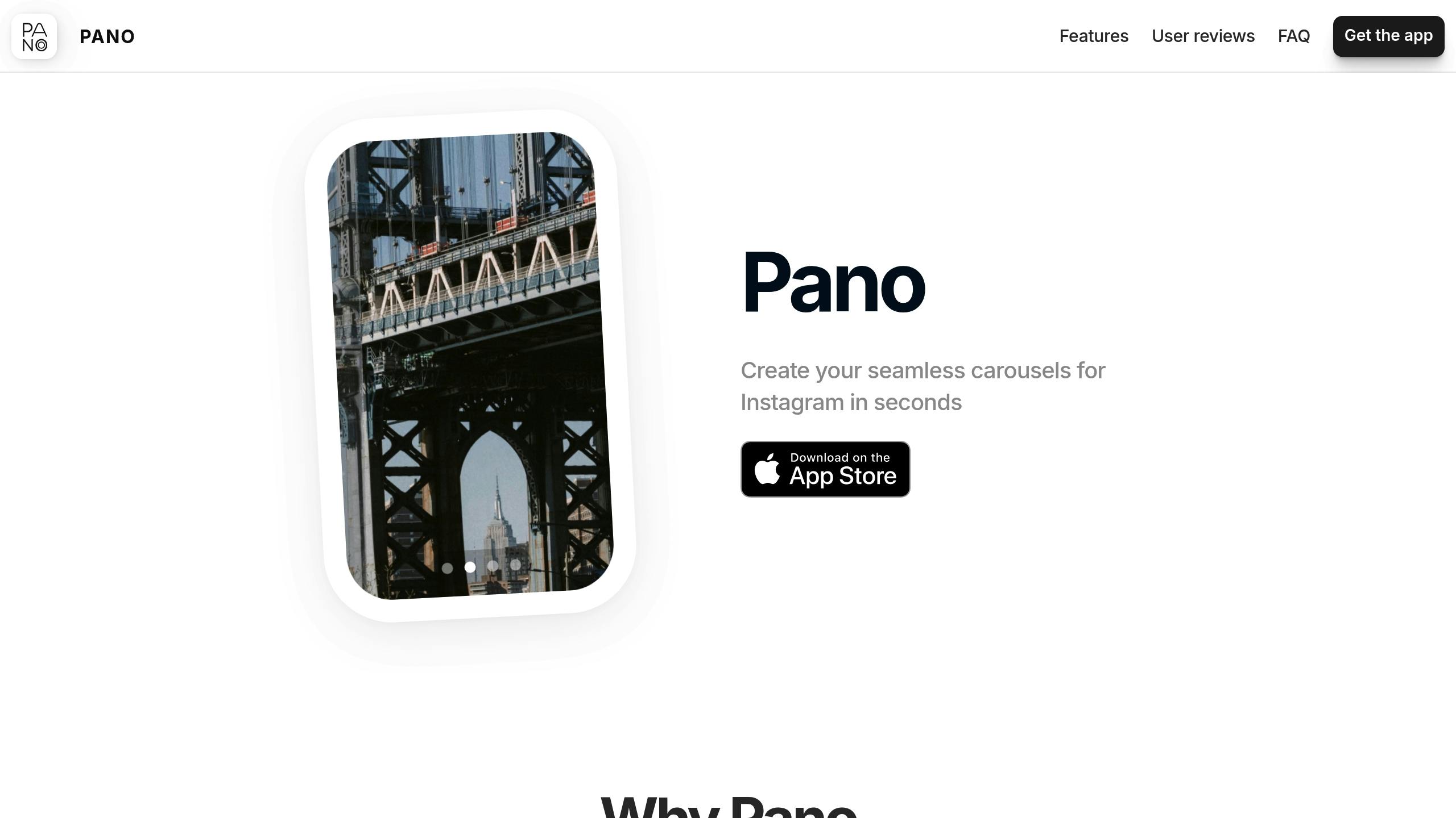
Pano is designed specifically for multi-slide carousels, catering to creators who need precise alignment. With support for up to 20 slides, it's become a favorite among over 100,000 users.
Key features include:
Tools that snap elements into place for perfect alignment
Pre-designed templates for consistent spacing
Support for text, stickers, and GIFs
Ability to create extended, multi-slide narratives
"Create your seamless carousels for Instagram in seconds. Turn your ideas into stunning carousel posts with our intuitive design tools." – Pano
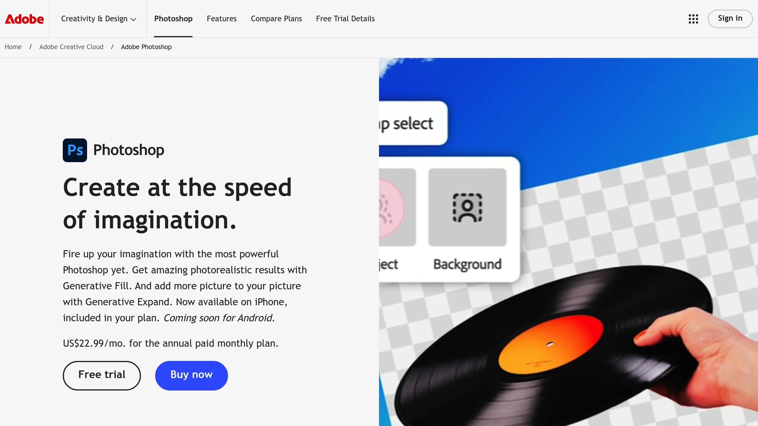
Advanced Design Software
For more complex layouts, design software offers enhanced features like grids, guides, and snapping tools. Here's a quick comparison:
These programs provide tools like grid systems, alignment guides, and Instagram-optimized export settings to elevate your design process. Pairing a specialized app like Pano with these software options gives you both Instagram-specific tools and advanced design flexibility.
Fixing Common Design Problems
Now that we've covered alignment and spacing, let's tackle some common design challenges and how to fix them.
Alignment Fixes
Misaligned elements - like text, margins, or drifting items - can make your carousel look unpolished. Here's a quick guide to correcting these problems:
Smart alignment tools can save you time and effort by reducing manual adjustments. Also, make sure your design looks great on all devices to avoid alignment issues in different formats.
Tips for Mobile Display
Test your design on various screen sizes to ensure text is easy to read, spacing is sufficient, and images stay sharp.
Adapt your designs for different Instagram formats while keeping alignment and aesthetics intact.
Once alignment and mobile display are sorted, focus on keeping your slides visually consistent.
Ensuring Slide Consistency
Consistency across slides is key to a professional-looking carousel. Here's how to achieve it:
Use a master template to lock in margins, element positions, and spacing.
Apply the same spacing rules for headers, paragraphs, images, and other elements.
Specialized tools can help enforce these rules automatically, giving your carousel a polished, cohesive look.
Conclusion
Main Points
Getting alignment and spacing right is crucial for crafting carousels that captivate and leave a lasting impression. The principles we’ve gone over emphasize keeping a visually balanced design by using consistent spacing, aligning elements properly, and planning layouts carefully.
Leverage tools like grids, uniform margins, and design software to create polished, smooth layouts.
For instance, tools like Pano simplify carousel design with built-in alignment features and ready-to-use templates.
These insights provide a solid foundation for improving your carousel designs.
Getting Started
Here’s how you can put these principles into practice:
Pick design software that includes alignment guides and spacing options.
Create a reusable master template with consistent margins and spacing.
Test your carousel on different devices to ensure it looks great everywhere.
If you’re just starting out, pre-built templates are a great way to learn how spacing works. Once you’re comfortable, try building custom layouts while keeping alignment and spacing consistent.
The best carousel designs balance precision and creativity. Clean, consistent spacing helps your content shine and keeps viewers engaged.
Pro tip: When working with multiple slides, use alignment tools to ensure smooth transitions between frames. This small detail can elevate your carousel's overall look and feel.
Related Blog Posts
Best Practices for First-Slide Carousel Hooks
How to Balance Text and Images on Carousel Slides