How to Align Text and Images in Instagram Carousels
Content Strategy
Mar 11, 2025
Learn how to effectively align text and images in Instagram carousels to enhance engagement and create visually appealing posts.
Aligning text and images in Instagram carousels can make your posts look professional, engaging, and easy to follow. Here’s how to do it:
Use Grids: Tools with snap-to-grid features keep everything aligned and organized.
Consistent Style: Stick to the same fonts, colors, and layouts across all slides.
Balanced Layouts: Combine text and images with a clear hierarchy - text should be readable and not overcrowded.
Plan Slide Flow: Start with a bold hook, follow with key content, and end with a call-to-action.
Spacing Matters: Add white space and consistent padding to avoid clutter.
Quick Tools to Try:
Pano: Offers templates, alignment tools, and multi-slide support.
Other Design Apps: Look for features like grids, templates, and customization options.
By focusing on alignment and flow, your carousels will stand out and effectively convey your message.
Create Stunning Instagram Carousels with Canva: Step-by-step Tutorial
Instagram Carousel Basics
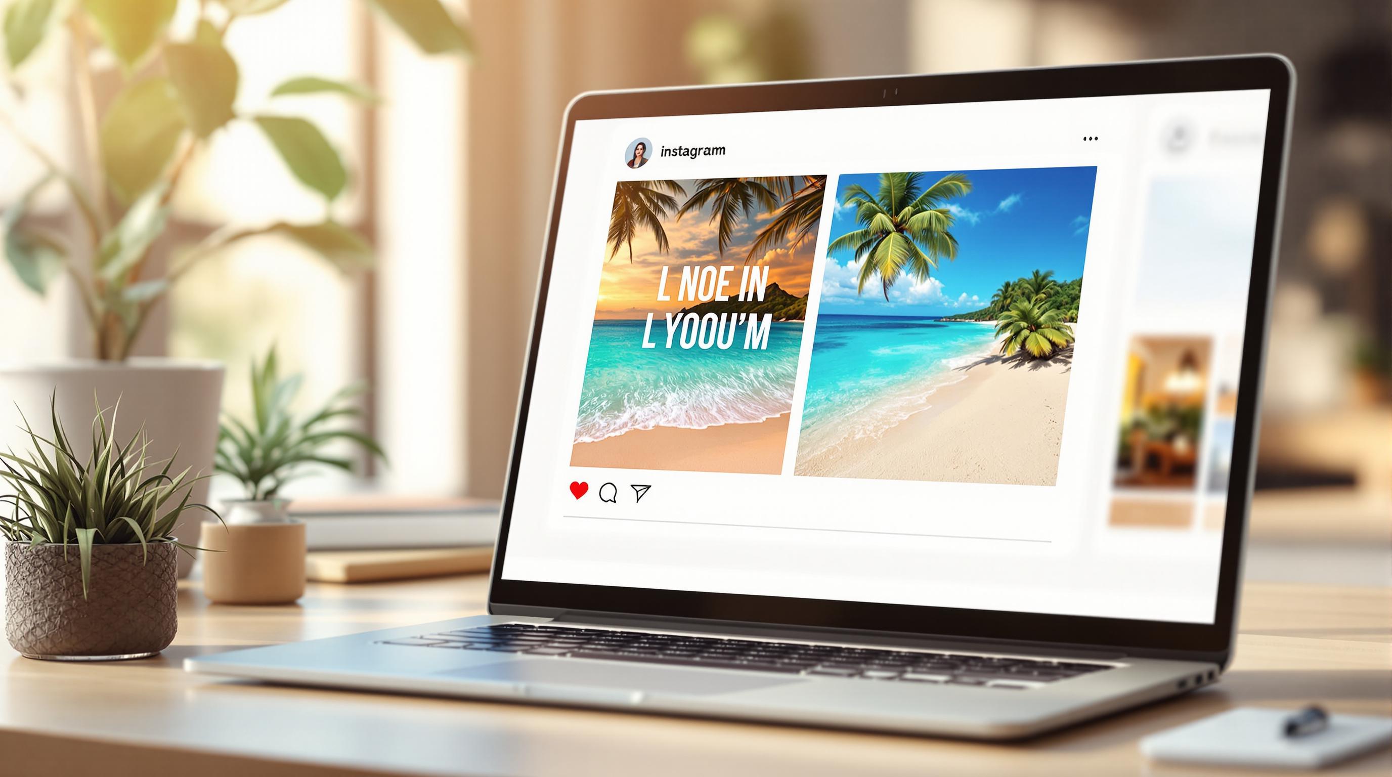
Instagram carousels allow you to share up to 10 images or videos in a single post. These swipeable galleries are great for grabbing attention and delivering detailed content.
What is an Instagram Carousel?
A carousel post appears as a square or rectangle with dots at the bottom, signaling that there are multiple slides. Users can swipe left to see more, making carousels perfect for:
Step-by-step guides
Before-and-after comparisons
Product highlights
Storytelling through visuals
Informative or educational content
Each slide works like a frame in a storyboard, helping you break down your message. While Instagram limits carousels to 10 slides, tools like Pano can push that to 20 slides, giving you extra space to tell your story.
Basic Design Rules
To create carousels that look polished and professional, follow these key design tips:
Stick to a Consistent Style: Use the same color palette, fonts, and design elements throughout to keep the focus on your message.
Use a Grid Layout: Align elements precisely with a grid system. Many design tools have built-in grid features to help.
Establish Visual Hierarchy: Highlight headlines and main visuals over smaller text or secondary graphics.
Leave Breathing Room: Include enough white space to keep the design clean and uncluttered.
Ensure a Smooth Flow: Keep a logical flow between slides by consistently placing recurring elements in the same spots.
Once you’ve nailed these basics, sketch out your layout to bring everything together into a seamless design.
Plan Your Carousel Layout
Here’s how to structure your carousel layout for a polished, engaging design:
Pick Your Theme and Colors
Start by creating a clear and cohesive look.
Stick to 2–3 main colors and 1–2 accent colors.
Light backgrounds work best, and incorporating your brand colors adds consistency.
For example, Pano's pre-made templates come with coordinated color palettes that make the design process easier.
Mix Text and Images
Balance visuals and text effectively:
Make the main image the centerpiece, covering about 60-70% of each slide.
Position text elements in the remaining space with a clear hierarchy.
Keep text placement consistent across slides for smooth transitions.
Limit text blocks to 2-3 lines per slide for better readability.
If you’re placing text over images, boost readability by adding semi-transparent backgrounds or colored blocks behind the text.
Map Your Slide Flow
Plan the flow of your content before you start designing:
Opening slide: Grab attention with a bold visual or statement.
Content slides: Break down your information into logical, easy-to-follow chunks.
Call-to-action slide: Wrap up with a clear next step for your audience.
Here’s a simple table to help you organize your slides:
Once your layout is planned, it’s time to focus on aligning text and images precisely for a polished result.
Text and Image Alignment Methods
Work with Grids
Grids are your go-to tool for keeping elements aligned and organized. They help create a clean, professional look that naturally directs your audience's attention.
Here’s how to make the most of grids:
Use design tools with snap-to-grid features for precise placement.
Keep margins and spacing uniform across all slides or layouts.
Pano’s built-in grid system simplifies this process by automatically aligning your elements, saving you time and effort. Once everything is aligned, focus on arranging your content to guide viewers effectively.
Set Up Visual Order
After aligning your content with a grid, prioritize what your audience sees first. Arrange elements to create a clear visual hierarchy. Place your main message where it stands out, followed by supporting visuals and details in a logical flow. This structure ensures your audience easily follows the content.
Add Space Between Elements
Spacing is key to making your design easy to read and visually appealing. Keep these tips in mind:
Leave enough space between text blocks to avoid crowding.
Use consistent padding around images for balance.
Incorporate white space to highlight important information.
For text overlays, consider adding a subtle background to keep the text readable without making the design feel cluttered. This small touch can make a big difference in keeping your layout clean and engaging.
Apps for Making Carousels
Creating carousels can be easier with the right tools. Apps like Pano help align text and images effortlessly, saving time and effort. Below are some tools you can rely on for designing carousels effectively.
Pano: Carousel Design Tool
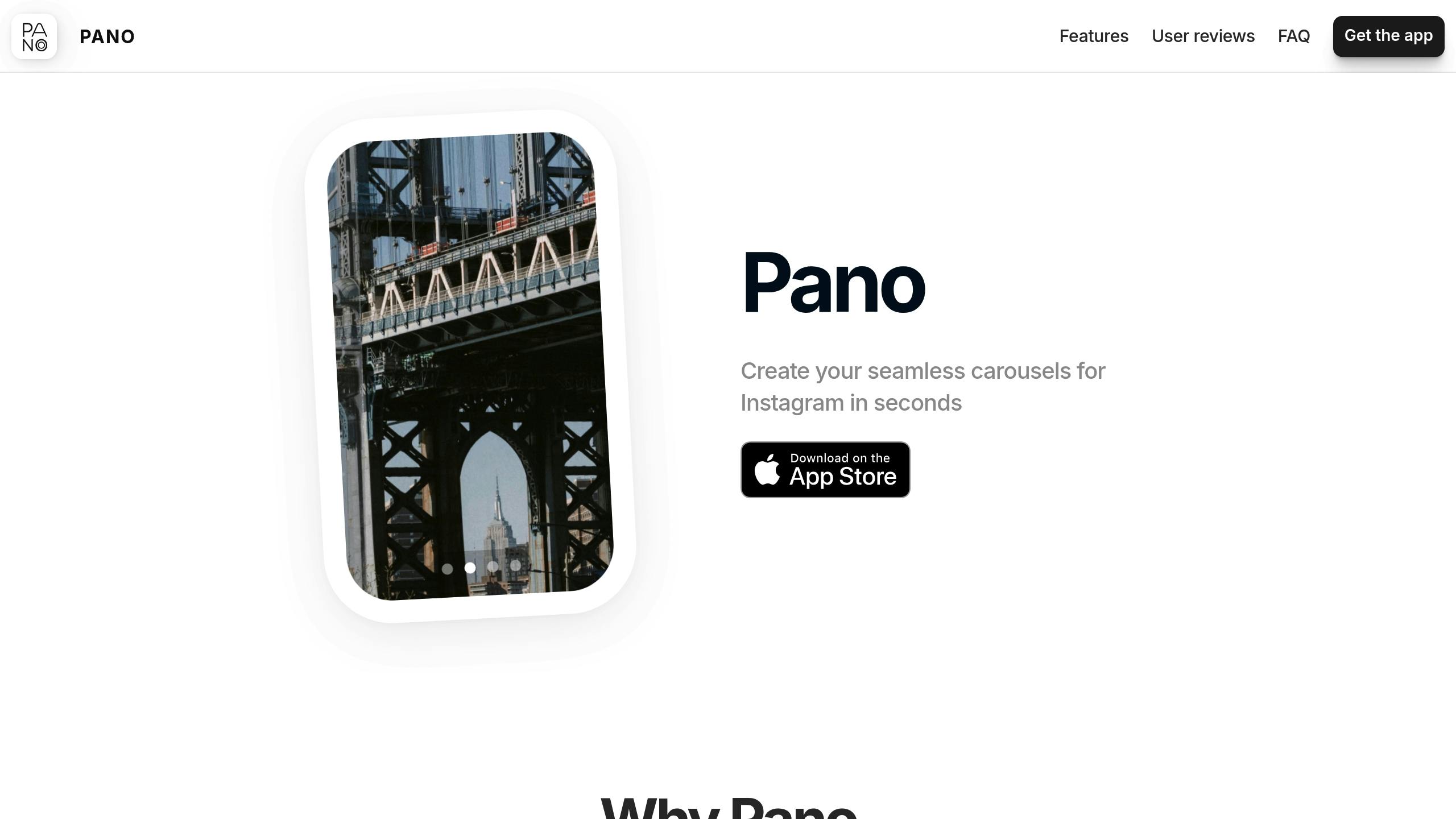
Pano is designed to simplify carousel creation with features like:
Users often highlight its ease of use:
"Love this app so much! Definitely one of the best!"
Other Design Tools
If Pano isn't your style, there are other tools available. Look for these features when choosing one:
Template Variety and Format Support: Tools with diverse layouts that work for different orientations.
Alignment Features: Built-in grids and snap-to guides to keep your designs neat.
Creative Freedom: Options to customize your designs while staying consistent with your brand.
For professionals, advanced options like team collaboration and priority support may be helpful. Meanwhile, casual users might find free plans more than enough.
"I just need to make a collage for an Instagram post and it was so quick and easy to make!"
Conclusion
Designing eye-catching Instagram carousels requires careful attention to how text and images are aligned. Proper alignment and a focus on key visuals help guide viewers effortlessly through your slides while maintaining a polished, professional look.
Tools like Pano make carousel creation easier by snapping elements into place and offering pre-designed templates. This allows creators to focus on their message instead of getting bogged down in technical details.
Here are some key tips for creating effective carousels:
Use grid-based layouts to keep your slides organized and professional.
Establish a visual hierarchy to draw attention to the most important elements.
Maintain consistent formatting across slides for a unified appearance.
Incorporate white space to make your design cleaner and easier to read.
By applying these techniques and using design tools with alignment features and multi-slide functionality, you can significantly improve the quality of your carousel posts. Whether you're sharing educational tips, showcasing products, or telling a story, precise alignment ensures your content connects with your audience.
As carousel posts continue to drive strong engagement on Instagram, mastering these alignment strategies not only enhances your carousels but also strengthens your overall visual storytelling.
Related Blog Posts
How to Balance Text and Images on Carousel Slides
Ultimate Guide to Carousel Alignment and Spacing