Best Practices for First-Slide Carousel Hooks
Social Media
Mar 7, 2025
Learn how to create captivating first slides for Instagram carousels with bold visuals and engaging text that keeps viewers swiping.

On Instagram, your first carousel slide is everything - it’s the hook that decides if users stop scrolling or engage. A strong first slide combines bold visuals, clear text, and a promise of value to keep viewers swiping. Here’s how to nail it:
Use Bold Visuals: High-contrast colors, clean layouts, and striking images grab attention fast.
Write Clear, Intriguing Text: Pose a question, present a challenge, or tease a benefit to spark curiosity.
Structure for Engagement:
Hook: A bold statement or question.
Bridge: Address a pain point.
Promise: Hint at the solution.
Track performance using metrics like swipe-through rates, saves, and completion rates. Tools like Pano can simplify design with templates and alignment features. Test different designs to see what works, and refine based on results.
Quick Tip: Keep it clean, concise, and mobile-friendly - your audience decides in seconds.
Key Parts of Strong First-Slide Hooks
Creating Visuals That Grab Attention
To make your visuals stand out, focus on high-contrast colors and layouts that naturally guide the viewer's eye.
Here’s what to include:
A bold image or graphic that pulls focus immediately
Clear, contrasting text that’s easy to read
Thoughtful use of white space to avoid clutter
A small accent, like a sticker or GIF, to add personality
Once the visuals grab attention, it’s time to craft text that hooks users.
Writing Text That Makes Users Swipe
Your text should spark curiosity right away, either by posing a problem or asking a question.
Here are some examples:
Question hooks: "Want to double your engagement rate?"
Number hooks: "5 design tricks pros don’t share"
Challenge hooks: "Your carousel strategy is missing this"
The key is to balance intrigue with clarity - give just enough information to show value but hold back the full answer to encourage swiping.
From there, transition smoothly into your story.
Starting Your Story Strong
With striking visuals and concise text in place, kick off your story by introducing a relatable problem and hinting at how you’ll solve it.
Structure your first slide in three parts:
Hook: Start with a bold statement or question to grab attention.
Bridge: Address a common pain point your audience faces.
Promise: Give a glimpse of the solution your slides will reveal.
Make sure the hook stands out as the largest text on the slide to guide the viewer’s eye naturally. Tools like Pano can help you stay on track with templates and alignment features, ensuring your design looks polished and builds trust.
Instagram Carousel Tutorial: 5 Essential Elements for Success
Tools and Methods for First-Slide Design
Make your first-slide hook stand out with these tools and design principles.
Pano: Simplify Carousel Slide Creation
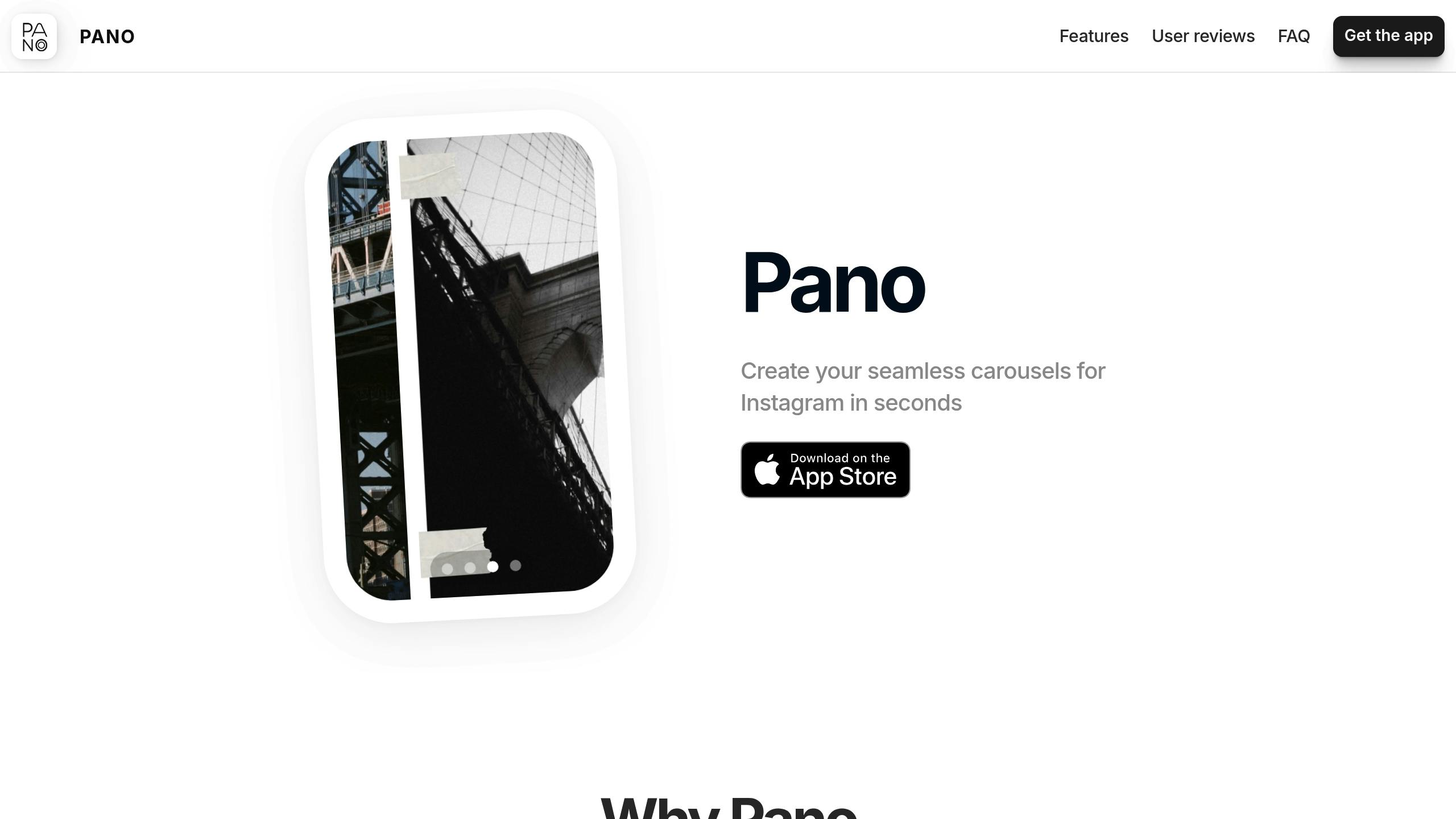
Pano is designed to streamline the process of creating Instagram-ready slides.
Here’s what makes it a go-to tool for first-slide design:
Template Library: Pre-made layouts tailored for Instagram.
Text Tools: Add and align text effortlessly.
Visual Elements: Use stickers and GIFs to add character without cluttering the design.
Format Support: Create slides that work perfectly for feed posts and stories.
"I just need to make a collage for an Instagram post and it was so quick and easy to make!" – Lubster24
With over 100,000 creators already using Pano, it’s proven to be a reliable option for carousel design. While Pano offers plenty of built-in tools, knowing the fundamentals of design helps you take your slides to the next level.
Design Basics: Colors, Fonts, and Layout
Strong design principles can make your first slide more engaging.
Color Selection
Stick to a maximum of three colors.
Follow the 60-30-10 rule for primary, secondary, and accent colors.
Ensure text contrasts well with the background (minimum 4.5:1 ratio).
Font Choices
Use one font for headlines and another for body text.
Keep font sizes between 14pt and 40pt for easy reading.
Bold headlines, and use regular weights for body text.
Layout Structure
To maximize impact, place your most eye-catching visual in the center or left side of the slide, where viewers naturally look first. Leave enough space around text to keep the design clean and easy to read.
Measuring and Improving Hook Performance
Creating visually appealing slides is just the beginning - tracking how they perform is just as important.
Split Testing Hook Designs
A/B testing your first-slide designs can reveal what works best. Here's how to do it:
Pick One Element to Test: Focus on a single variable, like the headline, layout, color, or CTA placement.
Set Clear Testing Rules: Run tests for one week, posting both versions at similar times for consistency.
Track and Compare Results: Use a table to organize findings. For example:
Tools like Pano’s templates make it easy to tweak and duplicate designs, simplifying the testing process. These insights help you refine your hooks for better engagement.
Key Metrics to Track Success
Focus on these metrics to evaluate your hook’s performance:
Primary Metrics:
Saves ratio: The number of saves compared to impressions.
Swipe-through rate: The percentage of viewers who move past the first slide.
Completion rate: How many people view all the slides.
Average time per slide: How long viewers spend on each slide.
Secondary Indicators:
Initial engagement: Likes and comments in the first hour.
Share rate: Shares divided by impressions.
Profile visits: Clicks to your profile from the carousel.
Compare these numbers to your baseline to spot areas for improvement. If results are underwhelming, ask yourself:
Is the value of the content clear?
Does the design grab attention quickly?
Is the text easy to read on mobile devices?
Does the layout make navigation intuitive?
Conclusion: Building Better First Slides
Crafting an engaging first slide is all about combining eye-catching visuals, clear text, and a bit of trial and error to keep your audience hooked. The first slide sets the tone, so it needs to grab attention and spark curiosity.
Quick Tips for First-Slide Success
To make your first slides stand out, focus on these key elements:
Visual Impact
Use bold, attention-grabbing visuals with clear directional cues (like an arrow or "Swipe →").
Keep the design clean and well-aligned for a polished look.
Content Structure
Keep text short and to the point, encouraging viewers to swipe.
Highlight a key benefit or insight to immediately connect with your audience.
Technical Execution
Use tools like Pano to create professional layouts and ensure smooth slide transitions.