Top Layout Ideas for Carousel Storyboards
Content Strategy
Mar 10, 2025
Explore 7 creative layout ideas for Instagram carousels that enhance storytelling, engagement, and visual appeal in your posts.
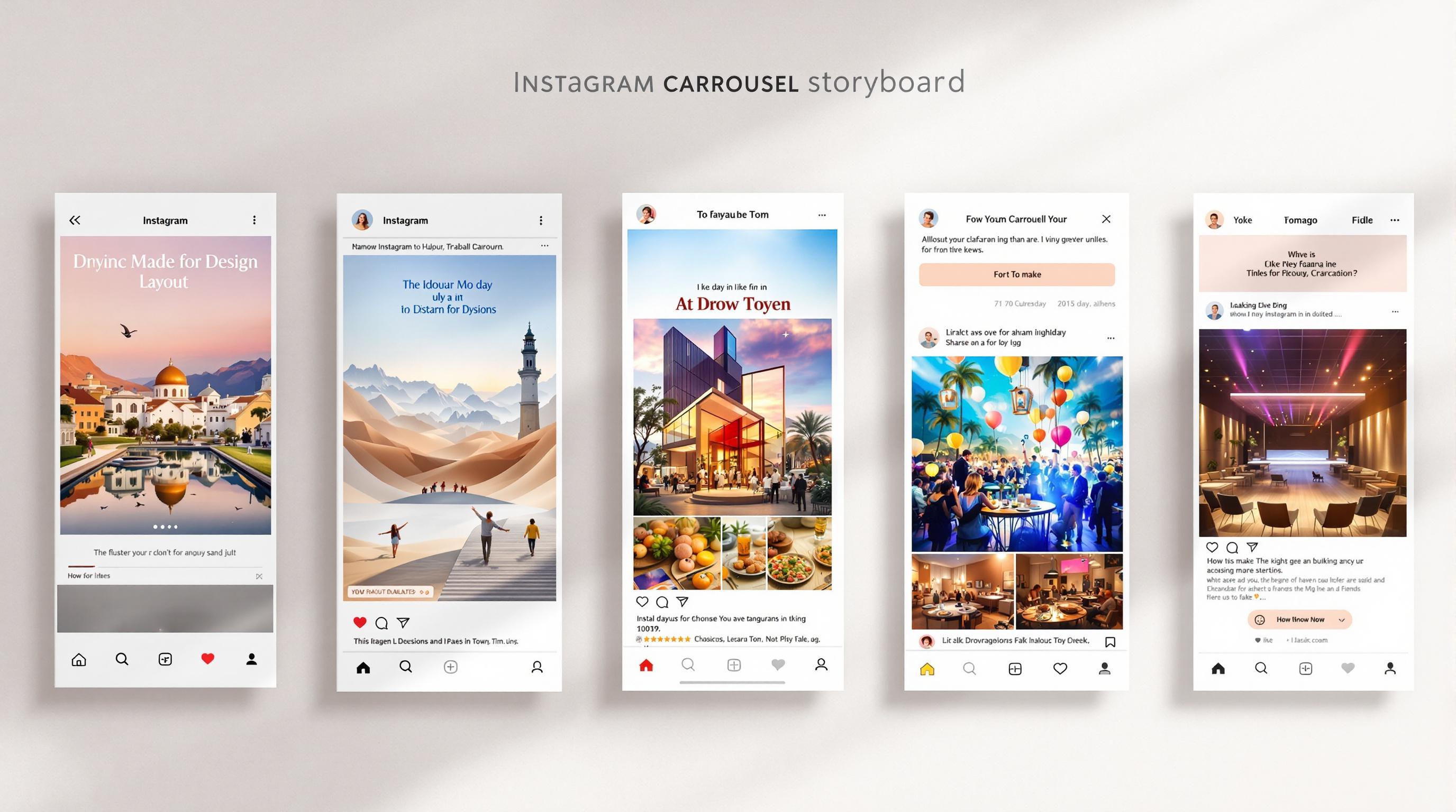
Instagram carousel posts are a great way to tell stories, showcase products, or share educational content. To make your carousel visually engaging and effective, you need a clear layout strategy. Here's a quick overview of the 7 best layout ideas for carousel storyboards:
Grid Format: Clean and organized for product displays or photo collections.
Panorama Slides: Create a continuous image spread across multiple slides.
Comparison Slides: Highlight differences, progress, or transformations.
How-To Guides: Step-by-step instructions for tutorials or processes.
Swipe-Through Quiz: Engage users with interactive Q&A slides.
Story Sequence: Narratives with a clear beginning, middle, and end.
Chart and Graph Series: Break down complex data into easy-to-follow visuals.
Quick Comparison Table
Pro Tip: Use tools like Pano to streamline your design process with templates, alignment guides, and support for up to 20 slides. Focus on clear visuals, consistent alignment, and concise messaging to keep your audience engaged.
Let’s dive deeper into each layout and how to make it work for your content!
Instagram Carousel Layout Templates and Design Strategies
1. Basic Grid Format
The basic grid format provides a clean and organized layout, making it perfect for displaying products, portfolios, or photo collections with a sense of order and balance.
A well-designed grid layout comes with several perks:
Consistent and polished look: Aligned elements create a professional appearance.
Quick scanning: Viewers can easily follow the predictable structure.
Versatility: Works well with both images and text.
For grid-based carousels, tools like Pano can help ensure perfect alignment with features like snap-to-grid functionality.
To make the most of your grid layout, follow these tips:
Keep equal spacing between elements.
Use alignment guides to position items precisely.
Balance content by leaving enough breathing room.
Stick to a consistent grid structure.
Here are some layout options to consider:
This format lays the groundwork for more creative layouts, combining simplicity with professional alignment tools to create engaging carousels.
2. Connected Panorama Slides
Connected panorama slides turn your Instagram carousel into one continuous image spread across multiple slides. This style works great for landscapes, product displays, or longer stories. The goal? To encourage viewers to swipe through the entire carousel while keeping each slide visually appealing on its own.
These layout styles let you tailor the visual flow to suit your story or brand message.
Tips for Designing Panorama Layouts
Break the image at natural points to maintain flow.
Ensure key elements align seamlessly across slides.
Consider Instagram’s interface gaps when designing.
Make each slide stand out on its own while contributing to the bigger picture.
Tools like Pano simplify the process with pre-made templates and support for up to 20 slides.
When adding text, stickers, or other design elements, use them sparingly to enhance the story. Consistent fonts and thoughtful placement will guide your audience through the carousel effortlessly.
Creating panoramic layouts requires both attention to detail and creativity to deliver a smooth, swipe-worthy experience.
3. Comparison Slides
Comparison slides are a great way to make Instagram carousels more engaging by visually showing contrasts, progress, or transformations. They're perfect for before-and-after scenarios, product comparisons, and highlighting feature differences.
Layout Options
Tips for Effective Design
To make your comparisons stand out, focus on clarity and organization. Here's how:
Use clear dividing lines to separate elements.
Align images consistently across all slides.
Match image sizes and angles for a seamless look.
Place text strategically to explain key points.
Add visual markers to emphasize differences.
Want to go further? Incorporate advanced techniques to create more detailed comparisons.
Advanced Ideas
Break bigger transformations into smaller, digestible steps across multiple slides. For example:
Show the stages of a product's development.
Highlight progress in a home renovation project.
Illustrate style changes over time.
Display the results of a service in stages.
K-aMorE has highlighted how Pano makes it easy to create polished comparison layouts with minimal effort.
Technical Tips
Pano's alignment tools help ensure everything is perfectly positioned. Use text, stickers, and GIFs sparingly so they don't distract from your main points.
Stick to one difference per slide to keep the message clear and engaging. This approach keeps viewers focused while delivering a strong visual impact.
4. How-To Guide Layout
Create a how-to carousel that simplifies complex processes into easy-to-follow, step-by-step instructions. Here's how to structure each slide to ensure clarity and effectiveness.
Slide Structure Essentials
Design Elements for Clear Instructions
To make your instructions easy to follow, ensure each slide includes:
Bold step numbers that stand out
Brief instructions (keep it to 2–3 lines)
Visual examples of the step
Progress markers to show where users are in the process
Additional details in smaller text for clarity
Visual Hierarchy Tips
Position key information at eye level to grab attention first, and arrange supporting details below in a logical flow.
Advanced Layout Techniques
For complex tutorials, break them into smaller, manageable actions. For instance, include specifics like how to use tools, timing details, or product application steps.
Technical Considerations
Use professional tools to achieve a polished look. Alignment tools like Pano can help maintain consistent placement across slides and support detailed multi-slide tutorials.
"Quick and easy to make collages for Instagram posts", says user Lubster24, emphasizing how intuitive tools can simplify the process.
Common Mistakes to Avoid
Ensure your layout is consistent and easy to follow by steering clear of these issues:
Overcrowding slides with too much information
Skipping important steps in the sequence
Assuming viewers already know certain details
Failing to provide clear visuals for each step
5. Swipe-Through Quiz
Turn your carousel into an interactive quiz to grab attention and keep users engaged. Below, you'll find a breakdown of how to structure and design a quiz layout that works seamlessly within your carousel.
Question-Answer Structure
Key Design Features
To ensure a smooth and engaging experience, focus on a consistent visual style across all slides. Here are some essential design tips:
Question Placement: Position questions in the top third of the slide with bold, large text for visibility.
Interaction Cues: Include swipe arrows or motion graphics to encourage user interaction.
Progress Indicators: Add slide numbers or a progress bar to show how far users have gone in the quiz.
Answer Reveal: Clearly differentiate question slides from answer slides with distinct formatting.
Layout Tips for Better Flow
Follow these tips to create a visually appealing and functional layout:
Keep the question text centered and easy to read, using clean and uncluttered backgrounds.
For multiple-choice answers, arrange options vertically with enough spacing to avoid a crowded look.
Maintain a logical flow between slides to keep users engaged throughout the quiz.
Technical Details
Use tools like Pano to ensure precise alignment and smooth transitions between slides. This helps maintain a polished and professional appearance.
Adding Interactive Elements
Boost engagement by integrating these features:
Visual Cues: Include arrows or motion lines to guide users on where to swipe.
Progress Tracking: Use small dots or numbers to indicate how many questions remain.
Answer Prompts: Add text like "Swipe to see the answer" to guide users through the experience.
Expert Design Advice
Just like grids or step-by-step guides, a quiz depends on clear alignment and consistent design to tell a compelling story. Make sure your layout keeps users curious without revealing answers too early. Use uniform styling across all slides to create a cohesive experience that feels intuitive and fun to navigate.
6. Story Sequence Layout
Story sequence layouts turn carousel posts into engaging narratives with a clear beginning, middle, and end, keeping your audience interested from start to finish.
Key Parts of a Story
Structuring Your Story Flow
Creating a story sequence relies on consistent visuals and a smooth narrative flow. Start with a compelling first slide to grab attention, then carry the theme through the sequence using matching colors, fonts, and design styles.
Tips for Visual Consistency
Stick to a unified color palette across all slides.
Include subtle prompts to encourage swiping.
Use white space effectively to keep slides clean and readable.
These elements set the stage for smooth transitions and cohesive storytelling.
Technical Details to Keep in Mind
Be aware of platform limitations and features. For example, tools like Pano allow up to 20 slides per carousel and include templates to help maintain alignment and consistency.
Advanced Layout Ideas
Smooth Transitions
Ensure your story flows naturally by using design elements that connect slides seamlessly.
Add connecting graphics or patterns between slides.
Include progress indicators to guide viewers.
Use visual breadcrumbs to link slides together.
Text Positioning
Keep text placement consistent across slides.
Break text into short, easy-to-read sections.
Adding Extra Impact to Your Story
Make your narrative more engaging with these features:
Add text overlays to provide context.
Use stickers or GIFs to create visual interest.
Incorporate white space to control pacing.
Include visual metaphors to emphasize key points.
7. Chart and Graph Series
Break down complex data into multiple slides to make it easier to understand and more engaging for your audience.
Structuring Data Across Slides
When using carousel slides to present data, organize the information in a logical flow:
Consistent alignment and clear visual markers help make your slides easy to follow.
Tips for Clear Data Design
Make your charts both visually appealing and easy to read by following these guidelines:
Color Usage
Stick to a consistent color scheme across all slides.
Use contrasting colors to improve readability.
Incorporate brand colors where applicable.
Typography
Add clear, concise titles to every chart.
Use font sizes that make labels and values easy to read.
Keep legends and annotations in the same position across slides.
Once the visual style is set, focus on technical details to ensure everything displays smoothly.
Technical Details to Keep in Mind
Apply the same design principles you’d use for grid or panorama layouts. Tools like Pano can help maintain uniformity across slides.
Choosing the Right Charts
Pick the best chart type for your data to ensure the message is clear:
Keep chart sizes consistent and place elements like titles and legends uniformly to create smooth transitions between slides. Add annotations, progress indicators, and interactive prompts to keep viewers engaged.
Adding Extra Features to Your Charts
Make your data more engaging by including:
Clear annotations to emphasize key insights.
Progress indicators to guide viewers through the slides.
Interactive features like swipe prompts.
Plenty of white space to avoid clutter.
Conclusion
Engage your audience by using a thoughtful mix of carousel layouts. As we've discussed, careful planning is the foundation of any effective carousel design.
Choosing the Right Layout Mix
Tailor your layout combinations to match your content goals. The success of your carousel lies in aligning the layout styles with your specific objectives:
Optimizing Your Design Process
Tools like Pano can simplify carousel creation, allowing you to focus on strategy. With features like ready-made templates, text overlays, stickers, and support for up to 20 slides, you can skip the technical hassle and concentrate on crafting your message effectively.
Technical Considerations
When combining different layout styles, keep these critical factors in mind:
Smooth Transitions: Ensure elements flow seamlessly between slides.
Clear Navigation: Use progress indicators to guide viewers through the sequence.
Format Compatibility: Double-check that your designs work across all Instagram formats.
These details help ensure your layouts come together as one cohesive story.
Making Your Layouts Work Together
A great carousel design isn’t just about picking layouts - it’s about creating a smooth, engaging experience that holds your audience's attention from start to finish. Combine different layout styles thoughtfully to tell a compelling story. For instance, you could open with a panorama to grab attention, move into a how-to sequence for added depth, and wrap up with comparison slides to drive your message home. The key is to create a swipe-worthy narrative that feels seamless and intentional.
Related Blog Posts
How to Align Text and Images in Instagram Carousels